Primary Lockup
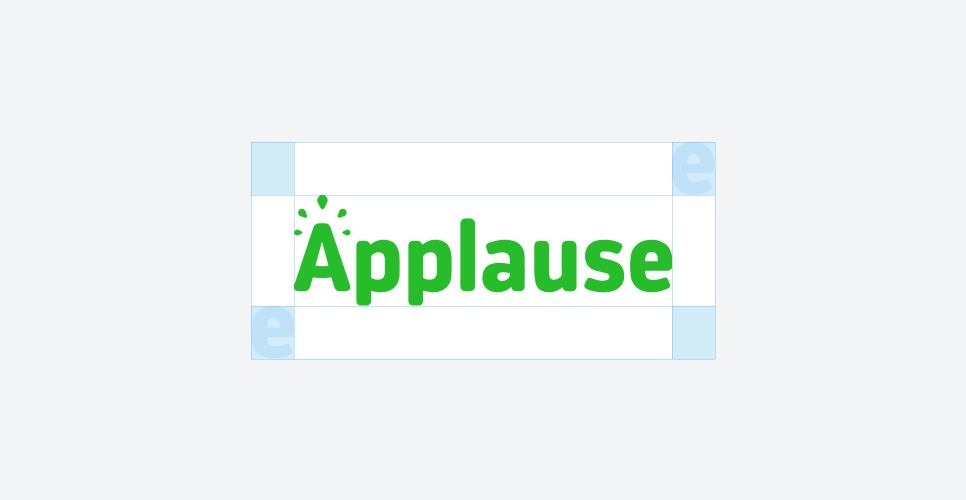
Clearspace
Secondary Lockups
Primary Palette
Green
Hex: #27BD2A
Blue
Hex: #003049
White
Hex: #FFFFFF
Charcol
Hex: #232323
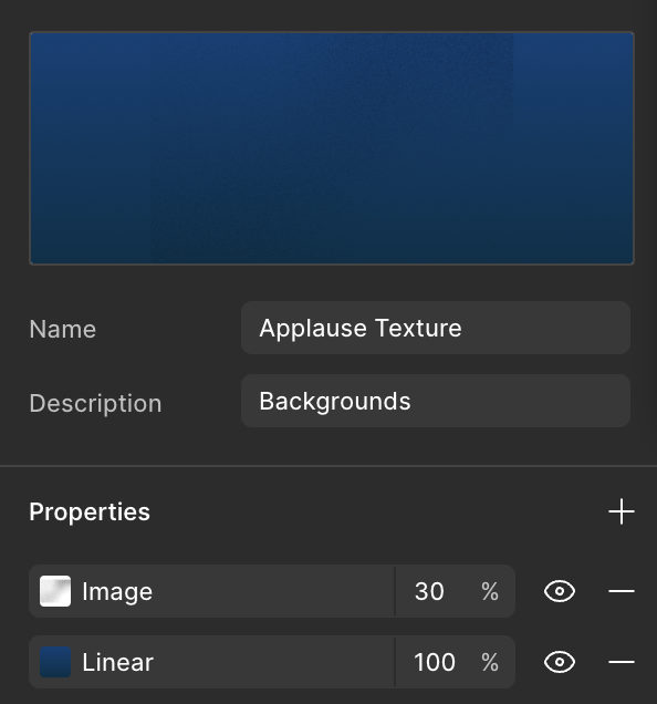
Gradient Palette

#034077
#003049
05 Typography
Applause’s typography reflects clarity, professionalism, and trust through a timeless pairing of modern sans-serif and refined serif typefaces. The primary typeface, Inter, delivers precision and legibility across digital and print experiences, making it ideal for data-heavy content, dashboards, and interfaces. Complementing this, Hedvig Letters Serif introduces credibility and tradition in reports, headlines, and financial communications, reinforcing expertise and reliability. Together, this combination creates a dynamic balance—modern yet approachable, analytical yet human—ensuring Applause’s voice is consistently clear, professional, and dependable.
